A perfect blend
Lithgow locals Darren and Kylie loved their holiday abode in Stockton, but with two grown up children and a stream of people who wanted to join in the fun, they realised their house, which had been the old butcher’s shop, wasn’t big enough to play host. The couple enjoy the calm and relaxed community vibe in Stockton and they love the location close to the beach.
So they decided to extend the home to accommodate their lifestyle. Kylie remarks, “With everybody here, our friends, our kids, and many relatives, it was just a little too small… especially around Christmas. One lounge room was just not enough.” Darren and Kylie bought the house in 2015 and spent most of their weekends there. Their son Joel, just finishing year 12, was the first to move in permanently, because he’d secured a carpenter’s apprenticeship in the area.
“We thought about adding another level to the house pretty early on,” reveals Darren. “As an old butcher’s shop, we knew its walls were double brick, making it a really sturdy structure to build on. And then there was the amazing view we’d have and we would be able to capture the sea breeze.”
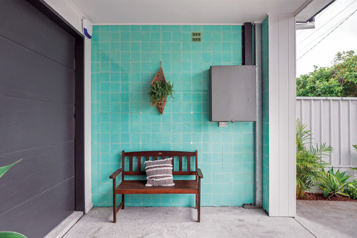
The tiles from the old butcher shop have been retained where possible. 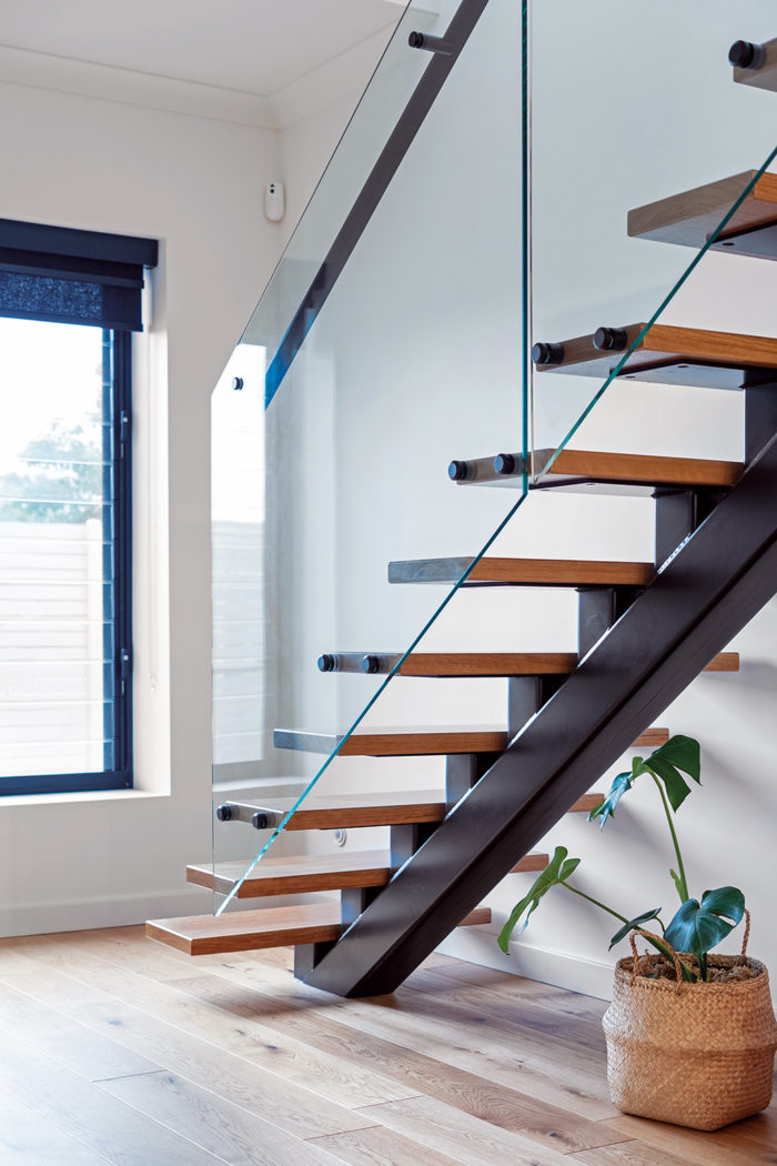
The stunning floating staircase leading up to the second floor. 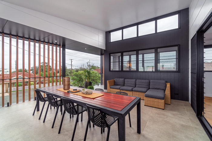
This versatile outdoor space was what the renovation was all about. Bradnam’s Windows&Doors Newcastle supplied all windows and glass doors. 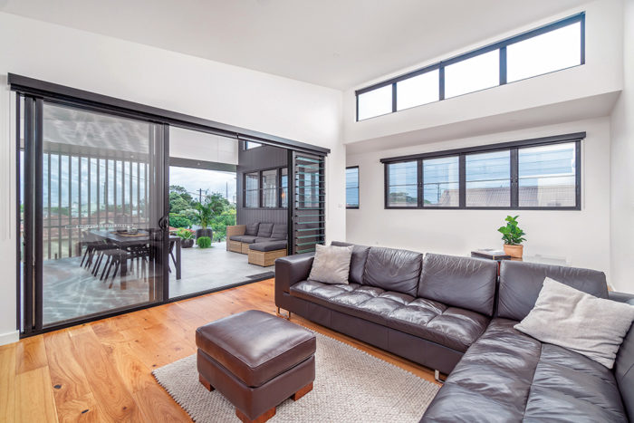
The upstairs living area with its seamless indoor-outdoor connection. 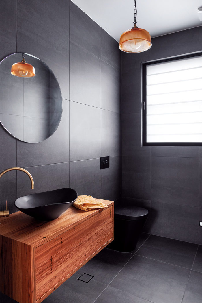
The black powder room was a gamble that paid off. 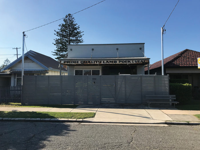
The old butcher shop sign was found at the start of the renovation.
Then and now
The previous owners had converted the old retail space into a residential property, and what had been the shop floor had become an open plan kitchen, dining and living area, with an original bathroom at the back. There were three bedrooms, one of which was originally the cool room.
The home lacked a garage and outdoor space for entertaining and Kylie and Darren also wanted a fourth bedroom and a second living area so kids and adults “wouldn’t be on top of each other.”
Kylie says, “When we sat down with our building designer Joel Coleman, he asked us what we wanted in a house and we said, ‘more space and light’. Being double brick – and triple brick in some places – the house is lovely and cool in summer, but we needed more light and warmth in the winter.”
Consequently, Joel’s designs made the most of the limited space and considered the movement of the sun throughout the year to ensure plenty of light and sun during the colder months. Joel explains, “The design was really about creating a space of wellbeing and enjoyment for Kylie, Darren and the family to enjoy for years to come. The main challenge was working with what was originally created to be a place of work and the practical commercial layout that came with it. So many on the fly decisions had to be made as we literally didn’t know what was behind each wall and how it affected the concept.”
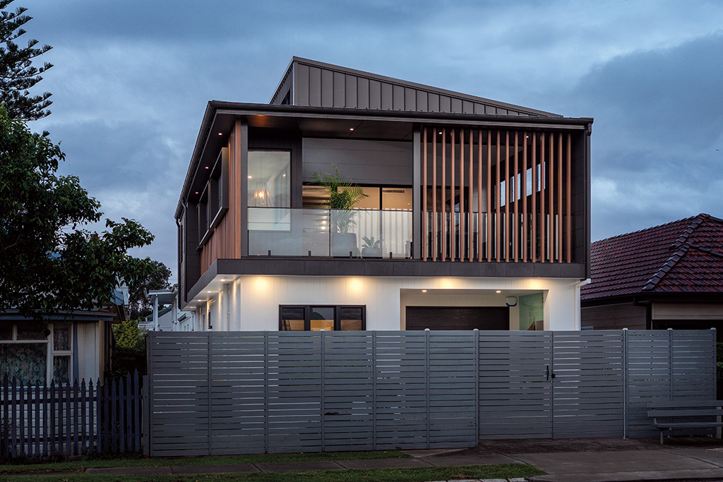
Also important to the couple was blending the old and new parts of the façade. “We didn’t want a jarring contrast between the 2020 and 1950s designs,” explains Kylie. It was important to get the right people to work with, of course, and Darren and Kylie went through a detailed selection process before enlisting builder Damian Ray from Intebuilt, who was “a perfect fit.”
Designer Joel Coleman couldn’t agree more: “It was the superior craftsmanship skills of Damian and his team that brought this project from the drawing board into reality.”
A whole new level
While building a second level was the focus of the project, the ground floor needed work too. Gutting the remnants of the butcher shop’s cool room seemed the best way to create the sizeable garage on Kylie and Darren’s wish list.
The cool room had been converted into a bedroom by the previous owners, who had retained the triple brick walls and extra thick concrete ceiling. “The ceiling was so massive, the doors leading in and out were like little hobbit doors,” comments Darren. “It was a huge job to get it all out, but the extra one and a half metres it added to the garage really made a difference to our storage space.”
The couple hadn’t planned on renovating the two ground floor bedrooms at the back of house but had a change of plans during the building phase.
“We ended up redoing the ceilings and wardrobes both in Joel’s room and in what was then our bedroom,” recalls Darren. Several untimely rainy days in a row sent water dripping down the walls, but the builders had covered the building with tarp, which helped limiting the damage. “In the end, it was a good thing,” Darren says happily.
“We found and removed some asbestos and the rooms look so much better than before.” They didn’t change the existing kitchen or the layout of the living and dining areas, but they did replace the original shop window, installing a bigger window to introduce more light. To tie the two levels together they chose engineered timber floating floors with an oak finish throughout the house.
Light and breezy
The stunning floating staircase is yet another standout feature of Darren and Kylie’s renovation. The black metal beam and timber treads, paired with a glass banister and black handrail is understated, modern and elegant, and doesn’t monopolise the space. It’s cleverly positioned in a corner of the living area, which is flooded in natural light from the skylight directly above and from generous louvre windows on the second floor. Upstairs, a spacious second living area sits underneath a stunning four-metre cathedral ceiling. Windows sit up high to capture the winter sun and floor-to-ceiling sliding glass doors connect it seamlessly to a spectacular outdoor space. Clearly, this is what this renovation has been all about.
Story by Cornelia Schulze, photography by Joshua Hogan
Read more in the Spring issue of Hunter&Coastal Lifestyle Magazine or subscribe here.

