…and always read the label!
Wine expert Sally Evans explains what it takes to come up with a label that sticks.
The shelves of every wine shop are crammed with hundreds of bottles of wine. They are largely identical, lined up like soldiers. As you stroll the aisles, each brand calls out to you, trying to grab your attention. The cacophony can be overwhelming. Their primary tool is their label, doubling as micro-advertisements or miniposters, with so much to tell you in so little time.
So much rests with these small squares of sticky paper, and every brand owner approaches the design task with a mix of excitement and dread. There are so many decisions to make – shape, colour, texture, font, paper stock, layout, print technique. How best to express variety, region, vineyard name, company name, brand name, sub-brand name, awards? Are all the legals and mandatories right? Listings of alcohol percentage, standard drinks, additives and health warnings must all follow the rules and regulations.
This task is not for the faint-hearted. And what to do with the back-label blurb? To my mind the space-filler full of fruity descriptors and roast meat accompaniments serves little purpose. Consumers want to know what’s different and special about a wine. They want stories about the people, the grape, the region.
Easier said than done. Not every wine producer is also a stylish copywriter. And the job is never finished. Ranges are constantly extended with new variants. New tiers are added to the brand pyramid. And of course, vintages change each year, which means new print runs and endless opportunities to tweak and change.
As a result, labels can become busy, confused and ineffective. Time for a redesign!
There are interesting stories behind the design of many wine labels. They broadly fall into three categories: heritage brands looking to freshen up, often without anyone noticing; designs in need of a total overhaul to reposition and revitalise; or first-time launches under pressure to create a splash.
Here are a few case studies of those who have done it well. Margaret Nolan and Rowena Curlewis established design shop Denomination in Sydney in 2002, expanding to London and San Francisco over time to become a global drinks packaging powerhouse known for their highly individualistic work.
This multi-award-winning duo is responsible for the design of a number of well-known Hunter wine brands, and they love working with the region’s rich history, which allows them to tell powerful stories through their designs. The main aim is to build a strong connection between the brand and their consumers. Rowena explains that a fundamental part of their process is to spend plenty of time on site with the winemaker and owner, getting to know what is special and unique about their story, their wines, their philosophy, and their location.
Building on obsession
Their recent revamp of the Scarborough portfolio began with a thorough probing of Ian Scarborough’s wine mind, which revealed his passion for everything chardonnay. He was clearly obsessed – about the different styles, clones, vineyard sites. Denomination recommended that the flagship range, in need of a significant rethink, be renamed The Obsessive, providing a deeper link with its maker.
The packaging was completely redesigned to include more premium cues, and it leapt off the shelves. A revamp of the well-known Classic series ensued, retaining the highly familiar and much-loved ribbon feature, which was reinterpreted with a fresh, modern design.
The team had more leeway with the new Offshoot range, which cleverly encapsulates a range of less traditional varietals, made by the family’s next generation winemaker, Jeremy. With the label featuring images of fresh, lush growth, the ideas of youth, renewal and approachability are easily conveyed.
An exciting opportunity for Denomination was the relaunch of Wandin Wines, whose new owners were keen to move away from previous associations with a popular TV show. More than a name evolution was required. They recognised the strategic importance of the property itself, which is all about weddings and gardens.
So the new brands focus on flowers, merging art, nature and romance. The sensual characteristics of their wines are thus reinforced. The Estate range matches the colours of individual blooms with each varietal, while the premium Reserve range highlights photography of lush bouquets popping from a moody black background. When lined up they could be the centrepiece of a wedding table, or a stunning still life painting. The repackaging was such a success that a trade visit to China resulted in two television interviews all about these distinctive Wandin labels.
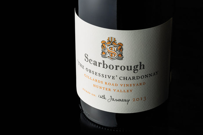
An obsession with chardonnay drove the label design for Ian Scarborough’s wines. 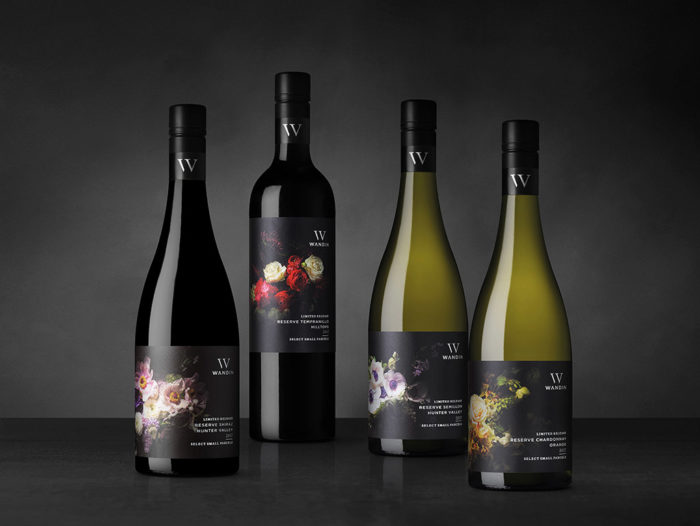
Wandin Wines wanted a complete re-design of their labels to showcase the importance of the property itself, which is all about weddings and gardens. 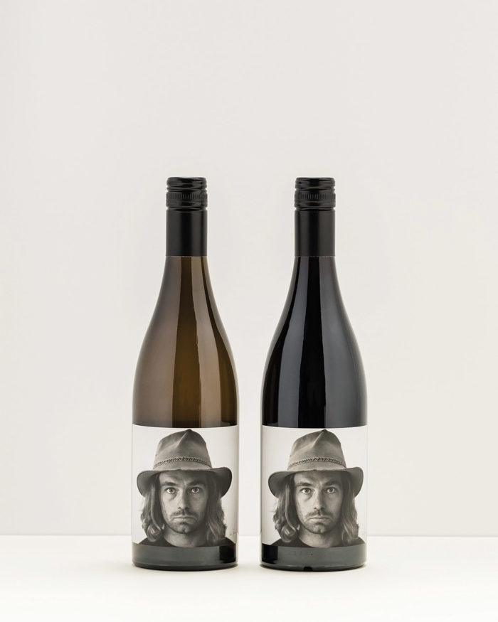
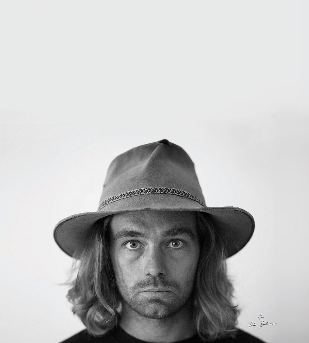
Angus Vinden’s labels are a reflection of his mood at the time he created the design
Denomination’s probing into Andrew Thomas’s wine ethos confirmed this Hunter character as one of the more confident and passionate local winemakers. The designers felt his personality was clearly represented by his signature, and it became the key element of this classic and contemporary label redesign. Launched over a decade ago, it still feels fresh today.
Back to their roots
An equally successful evolution has been Denominations’ update of Tyrrell’s highly familiar labels, which hadn’t been touched for 20 years. To reinforce the importance of the family name, Tyrrell’s Wines became just Tyrrell’s, and the crest was tweaked to make it instantly identifiable on the shelf. Craft and quality cues were reinforced across the various ranges in line with price points. This thoughtful refresh and update retains all that is familiar, while helping to transition the brand to a more modern space.
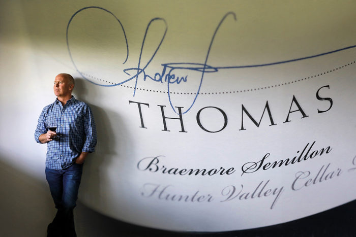
Andrew Thomas’s labels, first launched a decade ago, are still fresh today. 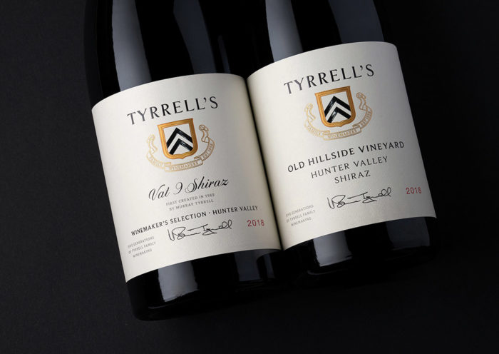
At Tyrrell’s, the name really says it all.
Art teacher Sally Sneddon took a course in digital design while on maternity leave from school in 1993, and has been designing Hunter Valley wine labels as part of her graphic design business Sneddon & Co ever since. Wine labels still account for a significant third of her Newcastle-based business, which was recently joined by designer daughter Anna.
Sally has had her hands on many Hunter brands, most significantly that of winemaker husband Bill Sneddon at Allandale. This brand is a great example of careful and considered brand development. An original etching featuring the stunning view from this well-known Lovedale winery has been a key feature of its label for more than 30 years, with constant adjustment over time to refresh and modernise.
The same graphic has been re-used recently as a textured watermark in their Reserve range, while a more contemporary watercolour interpretation has been used in a colourful new Celebration range.
Sally Sneddon’s designs. for Allandale use a contemporary watercolour scheme. 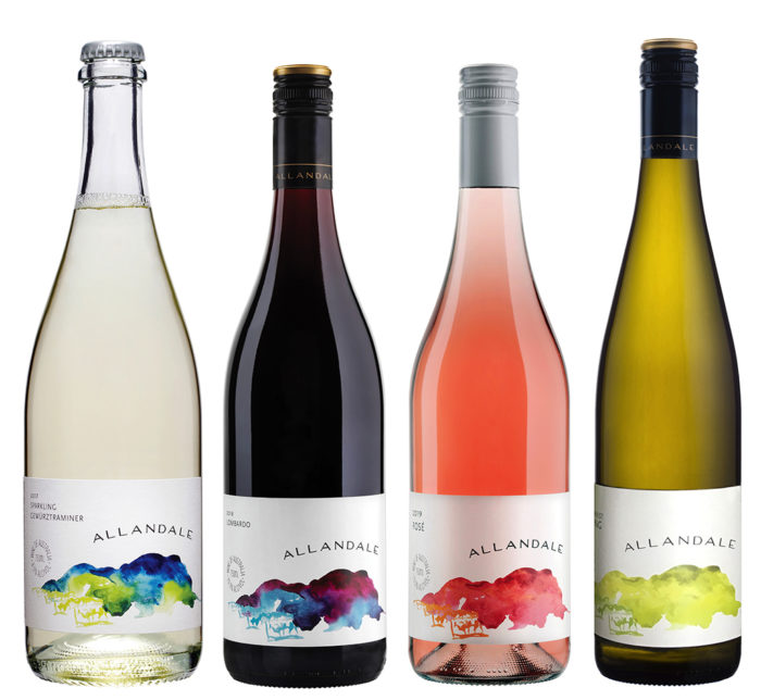
Comyns &Co wanted something “bold and edgy”.
Sally’s work for Jodie Belleville at Hart & Hunter resulted in a stylish two tier design. Both labels are elegant and minimalistic, and feature sophisticated use of texture. The white labels of the Single Vineyard Series highlight each site’s longitude and latitude, emphasising the importance of vineyard location. The design is subtle and tactile, with the coordinates included using blind embossing and a soft printed shadow.
Finding inspiration
Great wine label design and technology is not just the domain of fancy agencies, big brands and global corporations. Scotty and Missy Comyns found inspiration close to home. They released their new label Comyns & Co in 2016, aiming to create something “cool, unique, bold, edgy and different”, with Scott letting loose after many years as a corporate winemaker. After much unproductive navel-gazing, they handed over complete creative control to Scott’s talented younger brother, Angus, who was experienced in stenciling and screenprinting.
Scott gave Angus some starting cues and off he went. Each artwork is individually customised, borrowing inspiration from original comics, as well as street, pop, graffiti and tattoo art. Hidden within the label artwork are quotes, numerology and symbols.
Angus Vinden’s labels for his Face Wines. 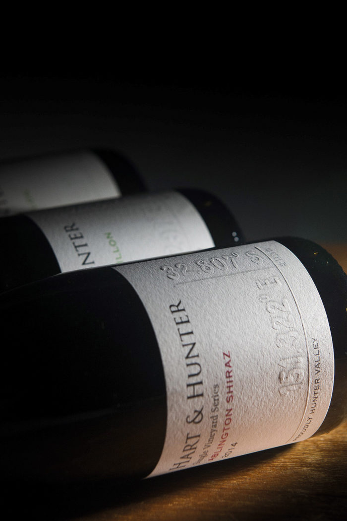
Hart & Hunter’s Single Vineyard white labels highlight each site’s longitude and latitude.
Second generation winemaker Angus Vinden is a former architect with a keen interest in photography and music. After the drought and fires of the previous months, Angus realised that 2020 was to be an interesting year to make wine. So he experimented with some very different wine styles that didn’t fit any of Vinden’s existing ranges.
Tiny batches of highly creative wines were produced, grouped as the Headcase Experimental Releases and nicknamed the Face Wines. Each of these unfined and unfiltered wines is named after a song by New Order – Age of Consent Shiraz/Gamay, Bizarre Love Triangle Gewurz.
The label was designed by Angus who does all his own graphic work. It is certainly compelling, featuring a striking black & white close-up of Angus’s face, looking tired, stressed, a little overwhelmed, a reflection of how he felt at that challenging time. He plans to continue this off-piste range each year, with his featured facial expression changing annually to reflect the mood of that year’s vintage. Let’s keep our fingers crossed that there will be a smile next year.
Photography courtesy of Denomination, Sneddon & Co, and wine makers
Read more in the Spring issue of Hunter&Coastal Lifestyle Magazine or subscribe here.