Let there be light
When Rob bought this 1920s Federation style home in Mayfield in 2015, he planned a low-key reno, and even considered flipping the property. But then he met his partner, Casey who has a keen eye for design and loves a good plan.
Even before he’d moved into his modest three-bedroom, one bathroom cottage in Mayfield, homeowner Rob had started to renovate it. The property needed some tough love and he ripped out the carpets in the bedrooms, installed built-in wardrobes and replaced the multi-layered, partially rotten internal walls.
Up until now Rob had done most of the work himself and his vision and plans were stored in his head. However, when he met his partner, Casey, and they decided to continue the renovation as a couple, that all changed. “Casey asked to see my plans and I had to admit I didn’t have any,” recalls Rob adding that finally putting the vision to paper “avoided costly mistakes.”
As they worked out the details, Rob and Casey quickly transitioned from a low touch reno to creating a home that would suit their lifestyle for at least another ten years.
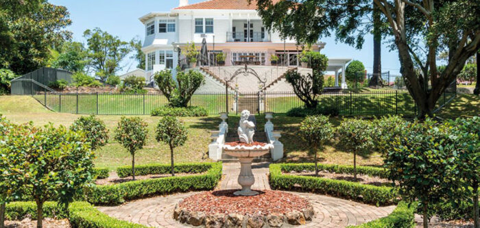
Keeping the home’s heritage intact was an important consideration. “We made a conscious effort to balance the very modern section at the back with the traditional features at the front,” Casey says. “That’s why we kept the original internal doors and sourced a replacement front door from the 1920s. We also kept the wall panelling and made the original archway the gateway from the traditional to the modern section of the home. We wanted to show that even in such a small home, you can have both.”
Being reno rookies, the couple went through a full selection process to find their builder, Spartan Projects.
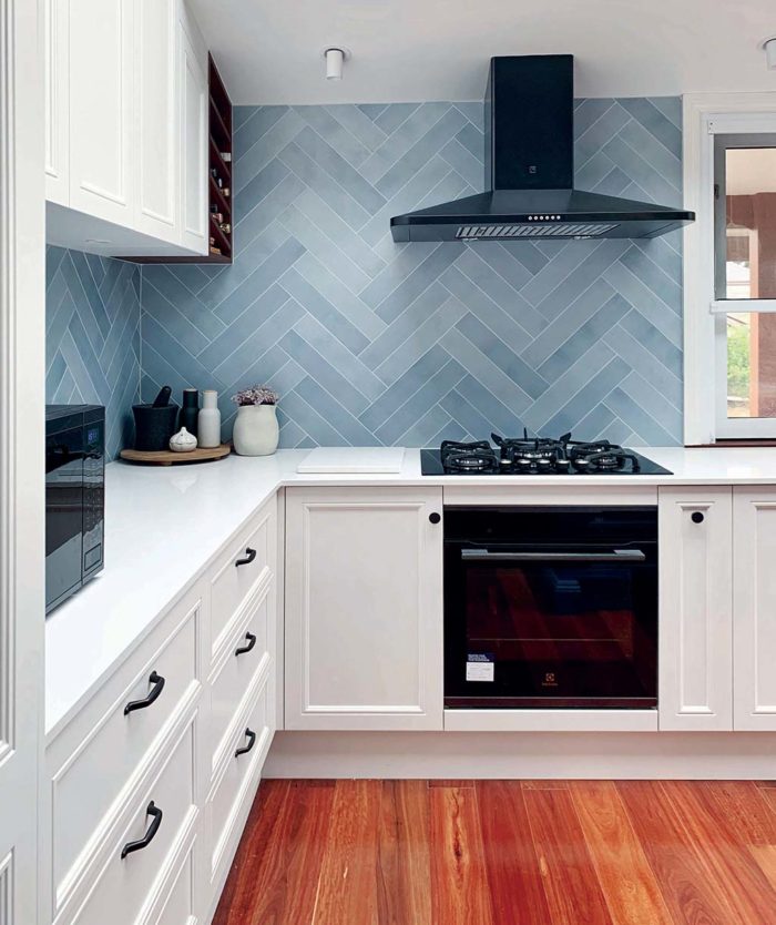
The striking chevron patterned splashback is a focal point in the kitchen. With the tiles made to order and with no samples provided, the couple had to take a leap of faith. 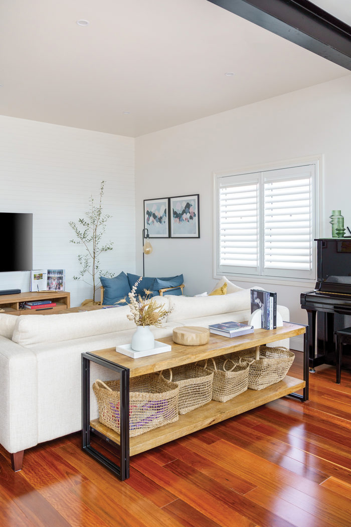
V-groove panelling on the back wall of the open plan living area is a nod to the wall marking the boundary of the heritage section of the home.
Re-working the layout
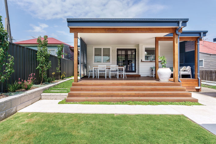
To create an open plan kitchen, living and dining area the couple extended the back of the home and took out internal walls. The bathroom was moved from its odd location at the back and now sits off the hallway, adjacent to the bedrooms.
The laundry remained but was closed off as a separate room. With the kitchen at the back there is an easy connection to the deck and backyard beyond. In one fell swoop, they had opened an awkward, slightly claustrophobic space and thoroughly revamped a layout that just wasn’t working.
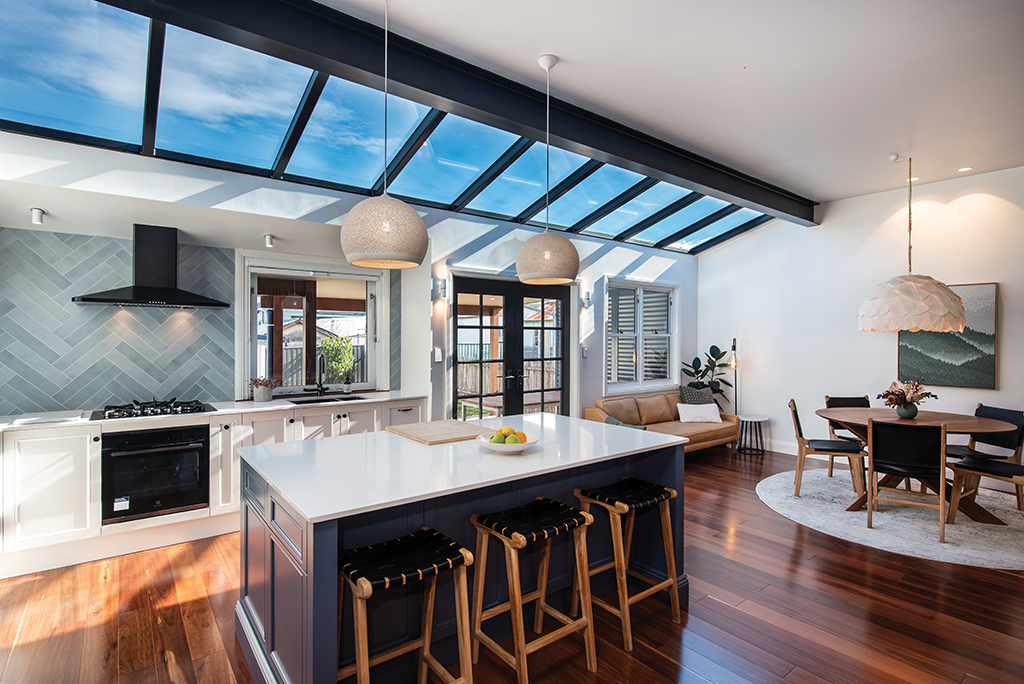
Bringing more daylight into the back of the home was also on the couple’s list of must-haves. On a narrow block with neighbours on both sides, their solution was simple and, in hindsight at least, quite obvious: bring the light in from above. “Casey did months and months of research to figure out the details of how this could work,” Rob says proudly.
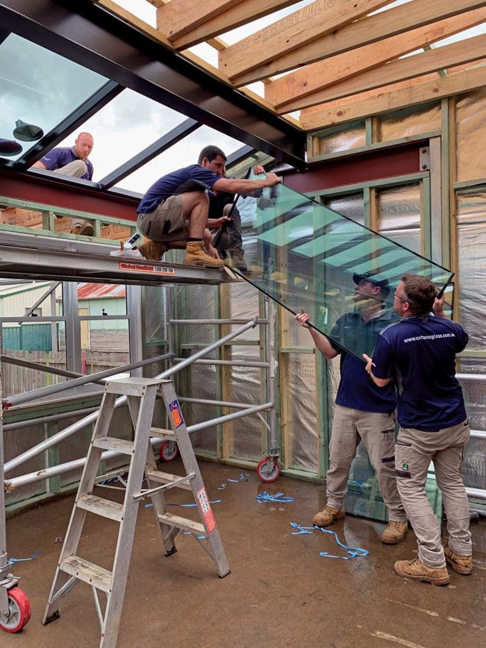
The skylights across the whole width of the home brought in the daylight they wanted without compromising their privacy, however it was also one of the most difficult features to pull off and took a big chunk of their budget.
The couple were adamant that they wanted a seamless run of lights, with minimal width bulkheads in between – hence the need for custom built steel, rather than aluminium frames to hold the weight of the glass.
Read more in the Autumn edition of Hunter & Coastal Lifestyle Magazine or subscribe here.
Story by Cornelia Schulze, photography by Trent Good, Fusion Media and Joshua Hogan

